
Published 1998-01-24.
Time to read: 4 minutes.
mentoring & advising collection.
I wrote this article 28 years ago. Much of it is still relevant.
Three well-known curves are in common use when discussing software marketing:
- Commoditization
- Geoffrey Moore’s technology adoption lifecycle
- Gartner’s hype cycle graph
It is interesting to line up all three of these graphs for a given technical market and try to predict opportunity. Careful consideration must be given to the scale and origin for each type of graph for any given technology. Before we do that, here are a few words about each type of graph.
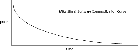
- The commoditization curve can be considered to be the inverse of Moore’s law. Initially, when a new technology is introduced, the unit price is quite high due to a small installed base to amortize R&D costs over, and to reflect the high degree of custom work required to apply the technology because of its rather raw state. Over time, the technology becomes more refined, and by the time that the technology can be ‘shrink-wrapped’, individuals need not have a great understanding of the internal moving parts to apply it. The price of products built on technology moves over time towards the cost of production (near zero for software) and implementation/installation. Mature technologies have well-known total costs of ownership for the products that implement them, which becomes a differentiating point when considering which product to acquire.
-
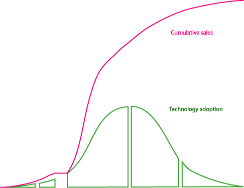
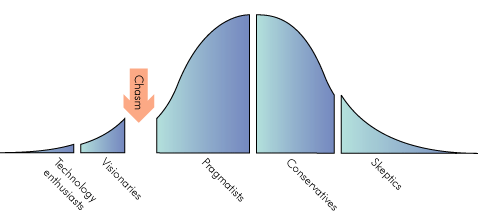
Geoffrey Moore’s technology adoption lifecycle graph describes how technology enthusiasts and visionaries
are the first to embrace a new technology, then there is an awkward period of time before the pragmatists starts to utilize the technology,
followed by conservatives and finally skeptics.
This image is from Wikipedia:
You might recall that this graph above shows the rate of sales over time, so the area under the graph shows the cumulative sales, which might look something like this:
-
Gartner’s hype cycle
is another interesting way of representing the maturity, adoption and business application of specific technologies.
The ‘visibility’ axis might be thought of as a measure of the degree of hyperbole experienced by a given technology.
The ‘maturity’ axis occurs through time, but rarely progresses at the same rate for any two technologies,
and the rate of increasing maturity is rarely linear with time.
The following graph is taken from
Gartner’s 2019 Hype Cycle Report:
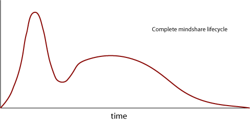
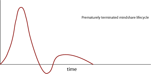
The graph appears to only go to the time of mainstream adoption. I question the exact meaning of the quantity measured along the ‘visibility’ axis. The intention seems to be to display the net positive ‘buzz’, perhaps as measured by technical publications and analyst reports. Once a product achieves mainstream adoption, Gartner seems to lose interest. This type of graph is suspect because it equates ‘visibility’ with a trend towards ubiquity. I’m interested in the complete product cycle, right to end of life, so, I’ve extended the hype cycle graph to EOL and renamed it to the ‘mindshare lifecycle’. The mindshare lifecycle graph differs from the hype cycle graph in that it drops to zero when people stop using it, and technology that is actively rejected could have a negative value. Here is a mindshare lifecycle graph for a successful technology, like DOS:

Here is a mindshare lifecycle graph for a technology that did not live up to expectations and died prematurely:
For each of the above types of graphs, it is important to note that different technologies, as applied to various markets, move along the timescale at different speeds. In other words, each technology matures at its own unique rate. Furthermore, while the three graphs each have an archetypical shape, the market and the nature of any given technology will influence the actual shape of the graph. For example, some technologies might experience a more rapid commoditization discount, a greater chasm or a deeper trough of disillusionment than others. Some technologies might not make it to the end of a cycle, having been rendered obsolete by alternative technology.
There is a natural coupling of the three types of graphs. Normally, commoditization occurs between the Gartner’s ‘peak of inflated expectations’ and the ‘slope of enlightenment’, which one might expect to encompass the adoption by Moore’s pragmatists. Casually superimposing the three graphs in results in an arbitrary but meaningless composite graph:
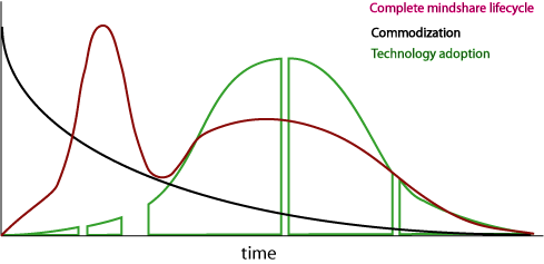
Let’s use more care to examine how to superposition the three types of charts on an imaginary new software technology. For the sake of argument, we will endow our imaginary technology with great promise, lots of publicity, and an open-source implementation that is available before any commercial implementation (any resemblance to actual technologies is purely co-incidental.) Because of the very active open-source community for this fictional technology, the commoditization curve very swiftly asymptotes to zero as it is built into a wide array of products and is applied to many industries. Does this mean no-one will make any profit on it? That depends on other factors such as the degree of technical discontinuity it introduces, any changes to established practices among potential users, regulatory issues, etc. These factors are all hidden inside the technology adoption lifecycle and hype cycle graphs.


